
How to Plan an Art Book Layout Step by Step
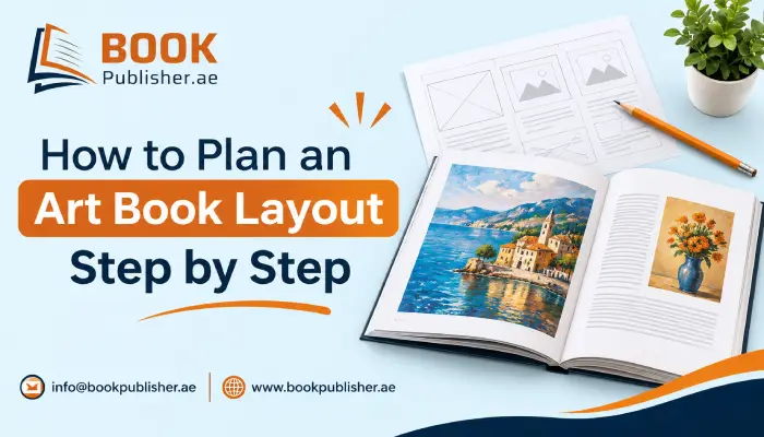
Take a moment to talk to anyone who has printed an art book, and most of them will share the pain of seeing that first proof only to discover that something is wrong. The imprint of the signature is squeezed into the fold, the landscape gets cut at the edge of the page, or the blue that looked deep on the monitor comes out more like grey. None of that is bad luck. It usually happens because the layout got decided during design, page by page, instead of before it. Planning first feels slower, but it’s the quicker route by a mile.
Why Should You Plan an Art Book Layout Before Starting the Design?
A story-driven book has a plot to keep readers moving. An art book only has sequence and space to do that job. If the arrangement appears chaotic, the entire manuscript appears chaotic as well. An approximate map illustrates which loud pages must be situated where and when, and whether all parts make sense.
It also makes life easier with printers. A clear brief covering size, page count, and paper gets a proper quote the first time, instead of after three rounds of emails with an art book publishing team.
What Do You Need to Decide Before Designing an Art Book?
A purpose for each category needs to be set first. Having a gallery submission book does not have the same feel as having a show catalogue or a gift for one’s close relatives, even for the same artwork. The first must be clinical, almost. The second must have space for essays and dates, and the third is allowed an entirely personal touch within limits. Thereafter, a few books that lay out and make a note of what is doing the work-white space, caption style, paper colour-will give you something to build on in the project.
Then comes a plain inventory of every piece going in, every piece left out, and every bit of writing such as an intro or artist statement. A common guideline from art book printers is to keep text around a fifth of the book. That keeps the pictures in charge, which is the whole point.
How Do Trim Size and Page Count Affect Your Art Book Layout?
Trim size is the finished dimension after the book is cut, and it’s the one decision that really shouldn’t change halfway. Swap it later, and every margin move and half the placed images need resizing. The artwork should pick the format. Wide landscapes feel cramped in a narrow portrait book, and tall figure studies float awkwardly in a landscape one.
Page count matters just as much early. Printing companies group sheets of paper into batches of pages, often in various quantities, for instance, 4 or 8 pages together. Hence, a document containing 50 pages can end up having 52 or 56 pages, depending on how the printer groups the sheets. Therefore, it is good to confirm with the printer before the layout is done.
How Can You Plan Art Book Spreads Before Using Design Software?
Paper works fine. A few rows of rectangles with boxes in which images can be inserted, and a few text lines. Problems arise very quickly, usually when we see that three complete pages are filled with work, or there is one image beside another, or there is no space to breathe. Moving a sticky note is not difficult, while moving a live InDesign page does.
Order is the other half of it. It could be arranged according to its subject matter or the type of medium. It would have different effects. Designers usually start a design with a paragraph and end it with an impressive one.
What Are Bleed, Safe Margins, and Gutter in Art Book Design?
Bleed refers to the image that extends beyond the trim edge, thus avoiding any white border. A safe margin is the distance between text features and the margin. The gutter is the area where the page is bent into the book spine, and some small notes may appear.
An easy way to check your print quality is to print out a spread in actual size, fold it down the centre and see how it looks in a folded state.
How Should You Prepare Images, Colours, and Fonts for Printing?
Images need to be around 300 dpi at the size they’ll print. A picture saved from a website looks fine on a phone, then turns blurry the moment it’s stretched across a page. Colour is the other classic trap, since most printers want CMYK and will convert RGB files themselves, which can wash out deep blues and bright greens.
It also helps to photograph all the originals in the same light, from the same angle. Uneven lighting is very hard to fix afterwards. For text, a single readable font for captions is plenty, and the fonts should be embedded in the PDF so the printer’s computer doesn’t quietly swap them.
What Can Art Book Designers Learn from Children’s Book Publishers?
Picture books are planned with almost military precision. Numerous children’s book publishers have the same size, for example, 8.5 × 8.5 inches, and 32 pages long, which leads to the fact that every page has to have justification. Some things are left undiscovered on purpose, and the text is written to be put in place rather than added later.
This discipline comes in handy while working on an art book in unexpected ways. It is crucial to choose the right content for any page of a catalogue, which makes it structured instead of just composed.
When Should You Consider Hiring a Professional Book Publisher?
Some artists enjoy handling everything through print-on-demand, and that’s a perfectly reasonable route for a small run. Others prefer trusting the editing, design, printing, and distribution processes to those who have been doing these activities for decades. There is one major point about manual or automated services. The price, deadline, and level of control required.
Searching for a book publisher near me is much more useful. The local publisher can check the files in person, present samples of paper and cover types, and print a copy of the book before its publication. It is worth remembering that colours do not correspond between the screen and paper, which makes the sample copy a real insurance for the art book.
FAQs
What resolution do my images need?
About 300 dpi at the size they’ll be printed. Anything pulled off a website will look fine on your phone and then turn blurry once it’s blown up across a full page.
Should I send RGB or CMYK files?
CMYK, since that’s what most printers work in. If you send RGB, they’ll convert it themselves, and that’s usually when your deep blues and bright greens go dull. Better to convert it yourself.
Why does my print look different from my screen?
Your screen is lit from behind, and paper isn’t, so some colours will never match perfectly. Get a physical proof. It’s the cheapest way to catch a colour problem before the whole run is printed.
Bottom Line
Planning an art book layout comes down to deciding things in the right order. Purpose, trim size, page count, spreads, margins, and then image and colour prep. Skipping ahead is what causes most of the expensive surprises at proof stage.
An afternoon of thumbnails and a quick call to the printer can save weeks of rework. When the pages are planned before they’re designed, the artwork gets to carry the book, which is exactly what it should do.
What part of planning an art book layout do you think deserves the most attention before the first page is designed?

I am a literary consultant and publishing strategist with over a decade of experience in the UAE’s vibrant book industry. I specialize in helping Emirati authors navigate the complexities of self-publishing, from fine-tuning manuscripts to mastering Amazon distribution. With a passion for transforming drafts into bestsellers, I provide actionable insights through my blogs for poets, novelists, and academic researchers looking to leave a lasting legacy.